LIL SNAPS

A few years ago my friend Chip gave me a big box of bones (he had them all identified and labeled) and an old family photo album that he didn't want.  A lot of the pix were not too interesting to me and I finally cut those up and used them in little collages.  But there were a few that I really liked and didn't want to cut.  Tonight when I was cleaning out my shelves I found a few of them between a couple of books...

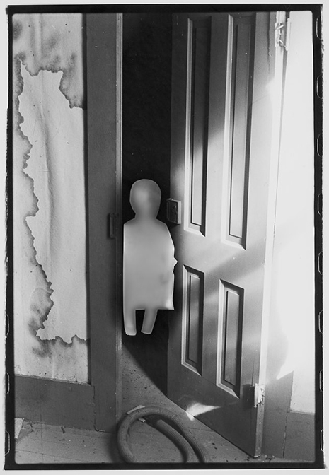
These elders chillin on the steps.

These elders chillin on the steps.

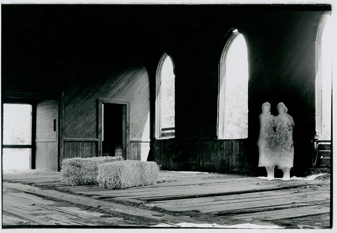
These sun-baked farm women

These sun-baked farm women

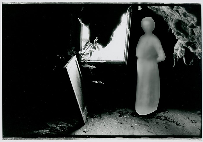
The pizza girl and her friend.

The pizza girl and her friend.

The pix here on my computer screen are actually somewhat bigger than the actual pieces of paper.

Olive Cotton portraiture award in photography...

An interesting discussion broke out on my Facebook page yesterday about the Olive Cotton award in photography.  The Australian-only award for the best portrait was $20,000, and the winning photograph was Justine Varga's portrait of her grandmother, shown below.  It's created on a 5x5 piece of film, and is a print of her grandmother's spit and scribbles.  Here is the piece:

Usually, I have clear cut opinions about such things.  But on this issue?  I am very divided and can see both sides of the argument.  My own experiences and sequence of thoughts on this issue went something like this: 

1.  OMGPLZ, what a load of shit.  More of "The Emperor's New Clothes."  More art world blather about art...more conceptual crap that leaves most viewers at the door. 

2.  But OK.  Do I like it as an image?  No.  Not really.  I don't think I'm unique in that...most people probably won't spend a great deal of time studying it.

3.  It doesn't really need to exist at all.  Because it's not about the image...it's about WHAT IT IS, not about what it shows.  It's about process, it's about traces, about what we leave behind, about what we are made of, what we do, what we are capable of.  

4.  Do I care about it?   No.  Well yeah.  Yeah...No.  Absolutely not.  Well kinda.  Gee, I dunno, I think I do actually care about it.  I do care that it turns the idea of Portraiture on its head -that it goes against what we generally think of as a portrait.  I also like that it goes against what we think a photograph (not just portraiture) IS...that a photograph may indeed be an object that never had fuck-all to do with a camera or a lens.  I also like that it focuses on the nature of authorship.   These are all important things that we take for granted in Photography. 

I mean, we all know what a portrait is, right?  From Wikipedia

A portrait is a painting, photograph, sculpture, or other artistic representation of a person, in which the face and its expression is predominant. The intent is to display the likeness, personality, and even the mood of the person. 

And what most people expect from portrait photography is a rendering of the face and shoulders...maybe a part of the torso.  But how boring is that?  And why should that be the one standard that constitutes a portrait?  In traditional portrait photography the interest in the photograph then hinges on whether or not the SUBJECT in the photograph is interesting, not on whether the photograph itself is, or on whether or not the process is meaningful. 

Regardless of where I end up in further ruminations, I'm glad she won...it has opened up the world of photography just a little bit, and I think it was brave for Shaun Lakin, the judge, to select it knowing as he must have, that the shit would hit the fan.

Here is his statement.  I like it a lot.


Dada

Wanna know how often I go out to things like concerts/shows/performances?  Like, hardly ever.  I can't remember when the last one was...maybe 5 years ago?  Longer?  shorter?  I dunno.  At some point I got over wanting to immerse myself in the scene.  And that goes not just for the music scene, but for the art scene too. 

Tonight I totally went out!  My friend, Joie, put me on the waiting list for Dada, and I have now finally seen him/them play in real life.  (as opposed to Youtube) 

Here are a couple pix I quickly snapped tonight -proof that I actually went somewhere besides my studio.

I also had the pleasure of meeting Phil's wife, Genevieve.  She is their manager and told me tonight that the desk person at their hotel told her that female band managers are almost non-existent.  She also told me how much she liked the photos I created with 7Horse, and that they might ask me to do another shoot with them.  I don't show those pix as part of my portfolio because they are nothing at all like my regular work, but I also really loved how those pix turned out.  Also, the shoot itself was really fun.  here are my favorite pix from that shoot:

Genevieve mentioned that she would like to come along for the next shoot to see what goes on.  I was, like, "yeah!  that would be great!"  then I thought...oh jeez...so she can see my tin foil snoots mounted onto shop lights.  LOL!!  I am just SOOOO professional. 

After doing the shoot with 7Horse I thought it might be fun to do a girl-group.  And start a page on my site with these kinds of band photos.  Meaning, NOT the kind where they are playing on stage...i don't actually like those kinds of pix.  but studio pix where I get to make little installations based on the band's theme du jour.  I guess there would have to be a sort of meeting of the minds, though, vibe-wise in order for it to work.  or maybe not.  I dunno; I've never done it. 

Good night, world.

difficult...

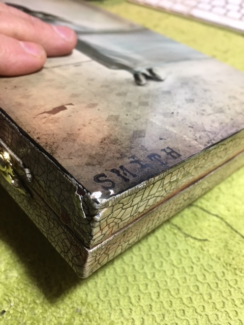
I'm trying to deal with the fact that one of my pieces was broken during a recent show in Boston.  Here is what my box actually looks like....

From the inside, one of the scrolls has been knocked loose and some of the little bee-bodies are coming out.  The inside is easy...I can just glue the scroll back in.  The bee-bodies?  I'm the only one who will know that they're missing...still, it does matter to me that they're gone. 

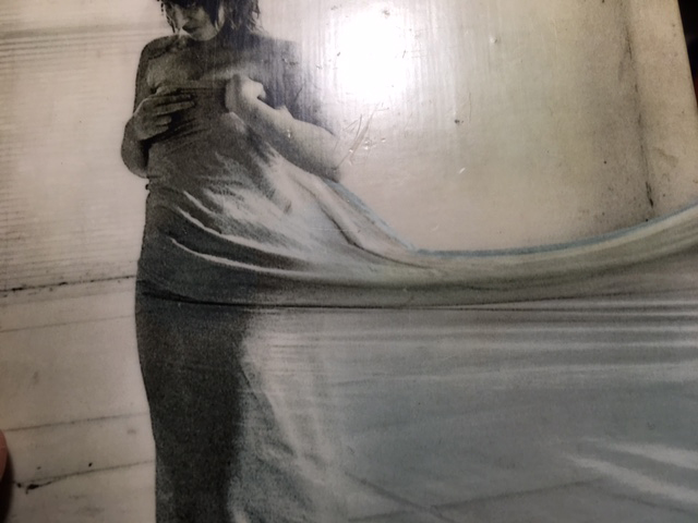
All told, my box is not in a million tiny splinters...I mean, there it is -it still exists.  But it is DEFINITELY, and without a doubt, broken.  When I sent it, it was perfect.  I don't send them out unless they are perfect.  You can clearly see in the first picture where my box hit the floor.  The paint is broken, some of it is missing, and the pigment in the acrylic skin is also broken off.  I haven't peeled anything off yet to see how the joint is.  I don't really wanna know.  The other corner is rounded (so it must also have taken some impact) and a small scuff took the pigment off the photo.  In the third photo --it was hard to get a picture of, but the surface/varnish scratched and pocked.  And the hinges are looser than they formerly were, and the box is dented. 

If you look at any of my boxes it looks like the paint on the edges is separate from the photo-skin, but in fact everything on either side is all one, smooth thing.  So in order to make this as it originally was, I would have to sand off the entire back side of the box and re-do it.  and I won't do that.  Because the integrity of the box isn't there...it's looser, and not being sure of the future of the joint on the bottom left, it just makes more sense for me to try to recreate a new one with a new box that is solid and un-banged-up.

I'm still upset about it as this is my favorite thing I've ever made.

So I get home from work on Friday night.  and find an email in my box from the gallery owner saying that her insurance company wants to talk to me on the PHONE.  Because it's "oddly quicker" (gallery person's words) than via email.

here is my reply:

Hi ________,
It doesn't make sense that they want to speak with me over the phone when 
all of my information would be electronically generated. Additionally, email 
leaves a communication trail that phone calls don't. And insurance companies 
are well-oiled machines...skilled at managing the lowest possible payouts to 
people who file claims, whereas I have filed precisely one claim in my entire
life, 36 years ago when I was 24 years old. So, no. This needs to happen via
email, where I can see what is happening and give thoughtful replies that are
not steered by an insurance company.

Another thing is this...I don't actually think I should have to go through 
this. I applied for the show and listed the price of the box on my 
application. You accepted it, and other galleries and museum curators have 
juried that particular box into shows at the same price. I have also shown 
other boxes and for all of them, I have set my prices carefully, after doing 
research, AND with the assistance of an experienced gallery owner. Here are
a couple that are up on PhotoEye.

http://www.photoeye.com/bookstore/citation.cfm?Catalog=zg429
http://www.photoeye.com/bookstore/citation.cfm?catalog=ZG474&i=&i2=

If you would like, I will ask the gallerist who helped me set the prices if 
she will vouch for me/my work/our pricing decisions. But...I think this isn't
right. I sent the box in good faith, and it was broken while on display there.

I believe the person whose child broke the box should have paid for it.
So that is where I am at right now.
Thanks for understanding.
smith

Why do I have to justify my prices to the insurance people AT ALL?  I have this idea that what they want to do is get me on the phone and ask me questions such as this:

How much does the paint that is actually on there cost?  $5.00?  oh, ok...so + $5 now how much did you spend on that bee hive?  nothing?  ok, so that is + $0.  And they will somehow wind up justifying sending me a check for $100 because that is the "value" of the individual materials that went into crafting the thing.

But what about all the other stuff that goes into all artists' creations?  What about the LIFETIME I've spent becoming the best at what I do?  What about the $ I've spent over the years just to get here?  on schooling, on supplies, on experimenting so that I could actually get something that looks like this?  What about just the time it took to make this?  How do I quantify that?  What about the value that exists because the sum of the parts is greater than the individual bits that went into making it?  What about the artistry?  What about the fact that this box, and all my boxes are containers of meaning.  That they are important things, that I cannot just let this roll off like so much water off a duck's back?

I'm tired.  Like sick and tired of taking all the financial hits.  WE ARTISTS pay for EVERYTHING.  We pay and pay and pay.  I've accepted that, to a certain extent.  That the power is lop-sided for most of us...that's just how it is.  But the very least galleries can do is not damage the work.  They charge us for applying, they have us pay for shipping to AND FROM the gallery and we provide them with free cool-as-shit inventory for a month.  But I am NOT paying for it when they break my things.  Nope.  Not.  Happening.

If this isn't resolved in a fair way I am taking it public, will post it on Facebook, will say who the gallery is, everything.  Because no.  I can't take it anymore. 

Interesting read...

I found Jake Romm's article about the subversive nature of Time Magazine's Trump cover particularly insightful.  of course, I'm talking about this photo:

Nutshell of his points...

1.  That the image is presented in a Kodachrome color palette -not something I would have noticed, btw- causing us to see the photo through whatever notions we have of the 1940's. 

2.  The pose and its relationship to other artworks depicting monarchs and leaders in seated positions.  His analysis of the power between the viewer and the subject of the photo, wherein the leader doesn't rise for the viewer -that the viewer must approach the leader... I also agree that there is a conspiratorial kind of expression generated by the looking-back-at-us body position as opposed to images of other leaders where we see them straight-on.

Romm also talks a bit about the shadow lurking in the background...I don't see any light source on the subject that would've cast that shadow, so adding it was a choice -a statement, if you will.

3.  THE CHAIR.  Which is one of the main things I noticed about the photo.  The back of it looks decayed...then your eyes go around and start noticing other things...like the chips in the paint.  And honestly, like the shadow.  For me, the decay on the back of the chair is so out of place that it causes me to closely observe the rest of the shot. 

Anyhow, worth thinking about.  Man, I love photography!

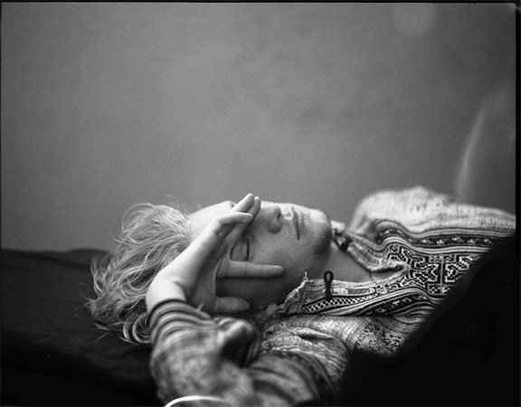
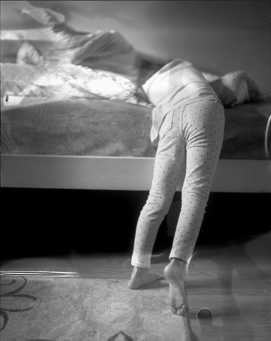
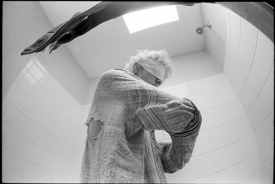
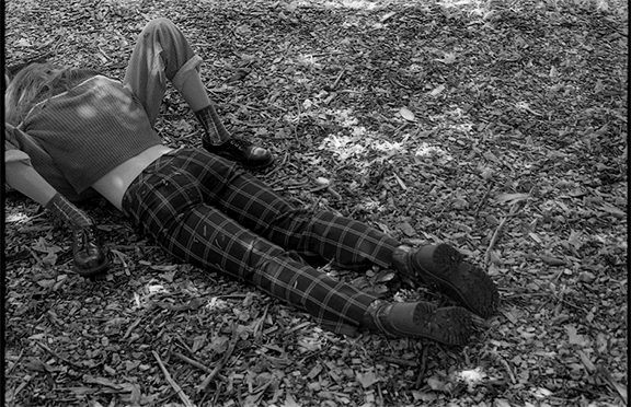
Thien Nguyen

One of the weirdest pedagogical experiences I get to have:  students who don't believe me.  Who come to me with a question for which I provide an answer, and then tell me I'm wrong.  Just for the record, because I have no problem confessing ignorance when I don't have answers, I am not actually wrong a lot. (LOL!! Don't ask my mom about this!) And since we're "on the record" I should also say that when I recognize that a question appears to require a subjective response I situate my feedback in context.  When these things don't work, I will say something like this:  "Student, pretend I am your client.  I just asked you for 5 widgets.  Give me the widgets or you won't be paid." or "GREAT!  I'm glad you love it printed with the 5 filter; you can put that on your refrigerator and now make one for me."
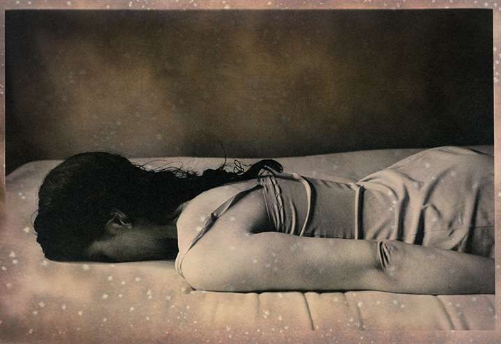
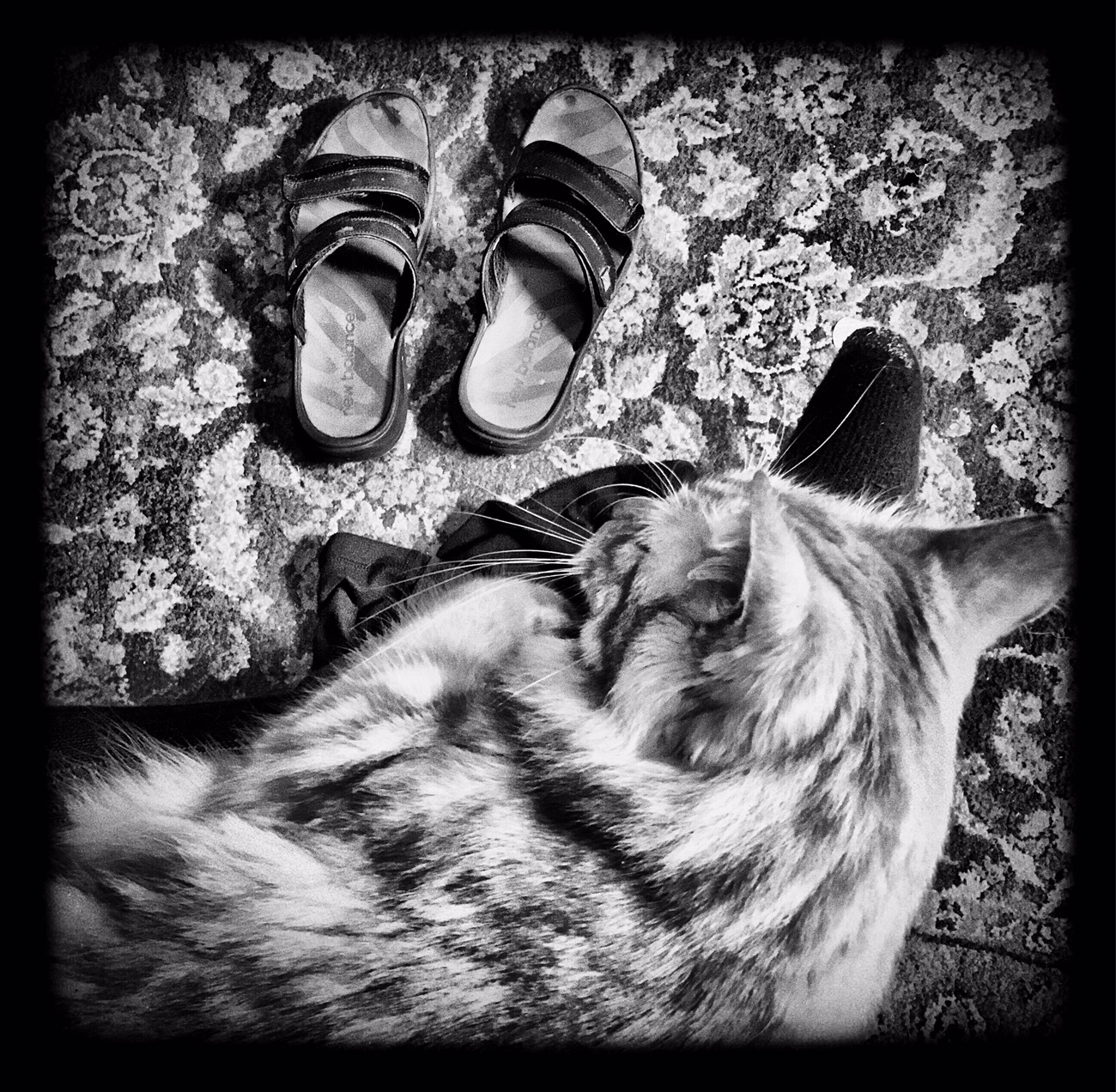
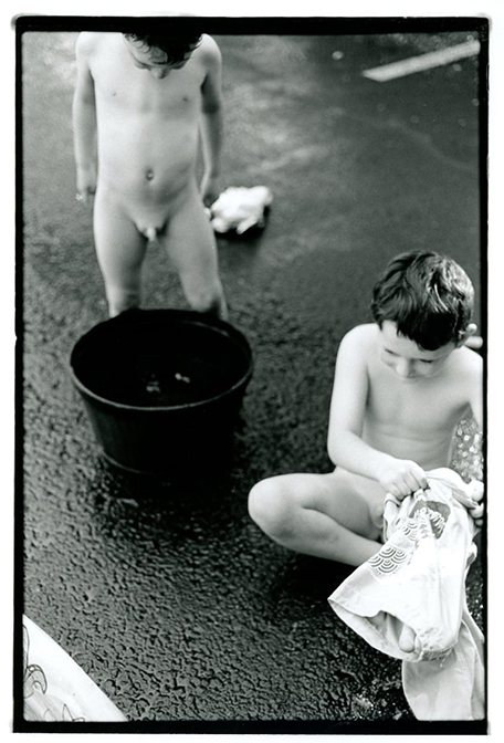
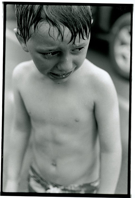
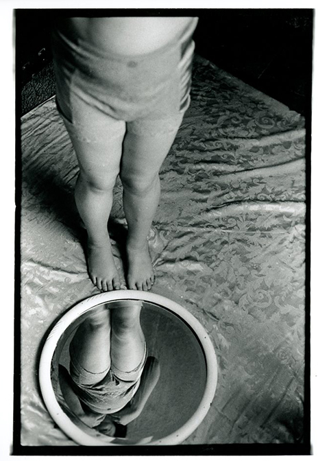
You might ask:  WTF with all this clap-trap about teaching when I'm posting awesome photos by one of my students?  Um.  Yeah.  Thien's been a pretty tough nut.  From happily stating in critique of others' efforts: "I don't like any of it."  to telling me I'm wrong about what a print should look like, to not getting stuff done on time because it's just his little way...this list could be extended, but you get the idea.  Thing is, he has also been one of the most rewarding students I've had in years.  

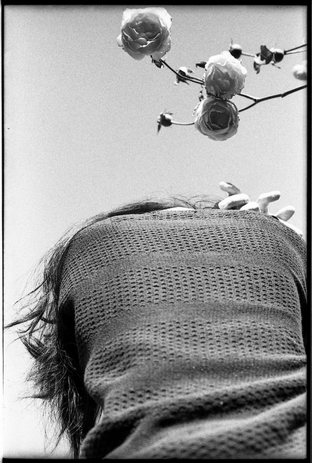
The dude is "ON."  Always thinking, always assessing, exploring, trying new things.  He wants to talk about stuff and he likes arguing and being challenged...he is actually looking for answers.  He's got his own style, and his own ideas which are complex and in constant flux.  And yeah, he has been critical of others' photos, but he also turns that critical eye onto his own work, and in my opinion, with really amazing results.  Furthermore, this quarter his prints have been golden, and he is developing his own photographic vision and style...I'm putting some of his work below.  

What I like the best about Thien's photos is that they are peculiar, unnatural somehow, surreal.   His use of fingers and legs as primary touch-points, the shapes he creates with bodies, and what's missing are all features that interest me about the photos and that leave me feeling that I've been allowed a glimpse into a privately coded universe where things are just half-a-bubble off.  I also love his attention to light, and his sense of overall composition.  If you would like to see more of Thien's work, you can check out his Flickr page!

Oh Fun!!!

I just Googled myself to see what my site looks like from a search engine perspective and discovered that someone at the Lomography site blogged about my work after seeing the show at Davis Orton!  So nice to see something positive like this at the end of such a difficult week!

Here is the entry!!